Recommendation engines or systems are machine learning algorithms to make relevant recommendations about the products and services and they are all around us. Few common examples are-
Amazon- People who buy this also buy this or who viewed this also viewed this
Facebook- Friends recommendation
Linkedin- Jobs that match you or network recommendation or who viewed this profile also viewed this profile
The main objective of these recommendation systems is to do following-
Customization or personalizaiton
Cross sell
Up sell
Customer retention
Address the “Long Tail” phenomenon seen in Online stores vs Brick and Mortar stores
60% of video watch time on Youtube is driven by the recommendation engine.
-Google.com
How do we build a Recommendation Engine?
There are three main approaches for building any recommendation system-
Collaborative Filtering–
Users and items matrix is built. Normally this matrix is sparse, i.e. most of the cells will be empty and hence some sort of matrix factorization ( such as SVD) is used to reduce dimensions. More on matrix factorization will be discussed later in this article.
The goal of these recommendation system is to find similarities among the users and items and recommend items which have high probability of being liked by a user given the similarities between users and items.
Similarities between users and items embeddings can be assessed using several similarity measures such as Correlation, Cosine Similarities, Jaccard Index, Hamming Distance. The most commonly used similarity measures are dotproducts, Cosine Similarity and Jaccard Index in a recommendation engine
These algorithms don’t require any domain expertise (unlike Content Based models) as it requires only a user and item matrix and related ratings/feedback and hence these algorithms can make a recommendation about an item to a user as long it can identify similar users and item in the matrix .
The flip side of these algorithms is that they may not be suitable for making recommendations about a new item that was not there in the user / item matrix on which the model was trained.
Content Based-
This type of recommendation engine focuses on finding characteristics, attributes, tags or features of the items and recommend other items which have some of the same features. Such as, recommend another action movie to a viewer who likes action movies.
Since this algorithm uses features of a product or service to make recommendations, this offers advantage of referring unique or niche items and can be scaled to make recommendations for a wide array of users. On the other hand, defining product features accurately will be key to success of these algorithms.
Hybrid-
These recommendation systems combine both of the above approaches.
Build Recommendation System in Python using ” Scikit – Surprise”-
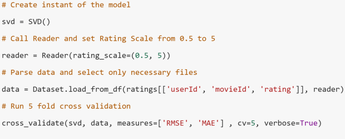
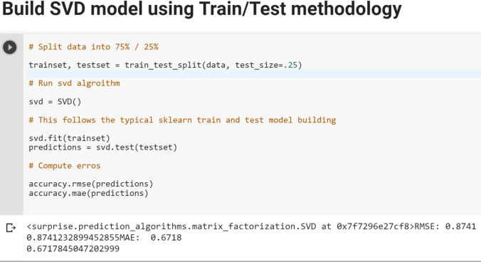
Now let’s switch gears and see how we can build recommendation engines in Python using a special Python library called Surprise. In this exercise, we will build a Collaborative Filtering algorithm using Singular Value Decomposition (SVD) for dimension reduction of a large User-Item Sparse matrix to provide more robust recommendations while avoiding computational complexity.
Here is how you can get started
Step 1- Please make sure that Anaconda and other packages such as Numpy are up to date
Step 2- Make sure you have Visual C++ compilers installed on your system as this package requires Cython Wheels. Here are couple of links to help you in this effort
Please note that if you don’t do the Step 2 correctly, you will get errors such as shown below – ” Failed building wheel for Scikit-surprise” or ” Microsoft Visual C++ 14 is required”
Step 3- Install Scikit- Surprise. Please make sure that you have Numpy installed before this
pip install numpy
pip install scikit-surprise
Step 4- Import scikit-surprise and make sure it’s correctly loaded
For sake of simplicity, you can also use Google Colab to work on the below example-
Let’s import Movielens small dataset for the purpose of building couple of Recommendation Engines using KNN and SVD algorithms. Please note the that the Surprise package offers many- many more algorithms to choose from. Data can be found at the link-https://grouplens.org/datasets/movielens/
Download the zip files and you will see the following files that you can import in Python to explore. However, for the purpose of CF models, we only need the ratings.csv file.
Here are some key steps that we will follow to build Recommendation Engine for this data
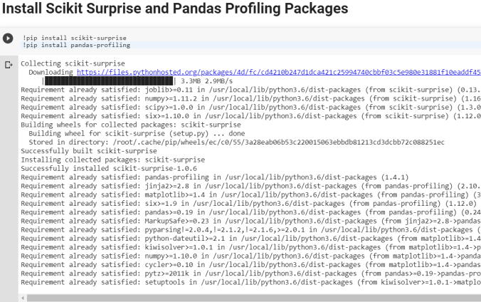
Install Scikit Surprise and Pandas Profiling Packages
Import necessary packages
Type Magic command to print multiple statements on a same line
The main objective of these recommendation systems is to do following-
Customization or personalizaiton
Cross sell
Up sell
Customer retention
Address the “Long Tail” phenomenon seen in Online stores vs Brick and Mortar stores
etc..
There are three main approaches for building any recommendation system-
Collaborative Filtering–
Users and items matrix is built. Normally this matrix is sparse, i.e. most of the cells will be empty. The goal of any recommendation system is to find similarities among the users and items and recommend items which have high probability of being liked by a user given the similarities between users and items.
Similarities between users and items can be assessed using several similarity measures such as Correlation, Cosine Similarities, Jaccard Index, Hamming Distance. The most commonly used similarity measures are Cosine Similarity and Jaccard Index in a recommendation engine
Content Based-
This type of recommendation engine focuses on finding the characteristics, attributes, tags or features of the items and recommend other items which have some of the same features. Such as recommend another action movie to a viewer who likes action movies.
Hybrid-
These recommendation systems combine both of the above approaches.
Build Recommendation System in Python using ” Scikit – Surprise”-
Now let’s switch gears and see how we can build recommendation engines in Python using a special Python library called Surprise.
This library offers all the necessary tools such as different algorithms (SVD, kNN, Matrix Factorization), in built datasets, similarity modules (Cosine, MSD, Pearson), sampling and models evaluations modules.
Here is how you can get started
Step 1- Switch to Python 2.7 Kernel, I couldn’t make it work in 3.6 and hence needed to install 2.7 as well in my Jupyter notebook environment
Step 2- Make sure you have Visual C++ compilers installed on your system as this package requires Cython Wheels. Here are couple of links to help you in this effort
Please note that if you don’t do the Step 2 correctly, you will get errors such as shown below – ” Failed building wheel for Scikit-surprise” or ” Microsoft Visual C++ 14 is required”
Step 3- Install Scikit- Surprise. Please make sure that you have Numpy installed before this
pip install numpy
pip install scikit-surprise
Step 4- Import scikit-surprise and make sure it’s correctly loaded
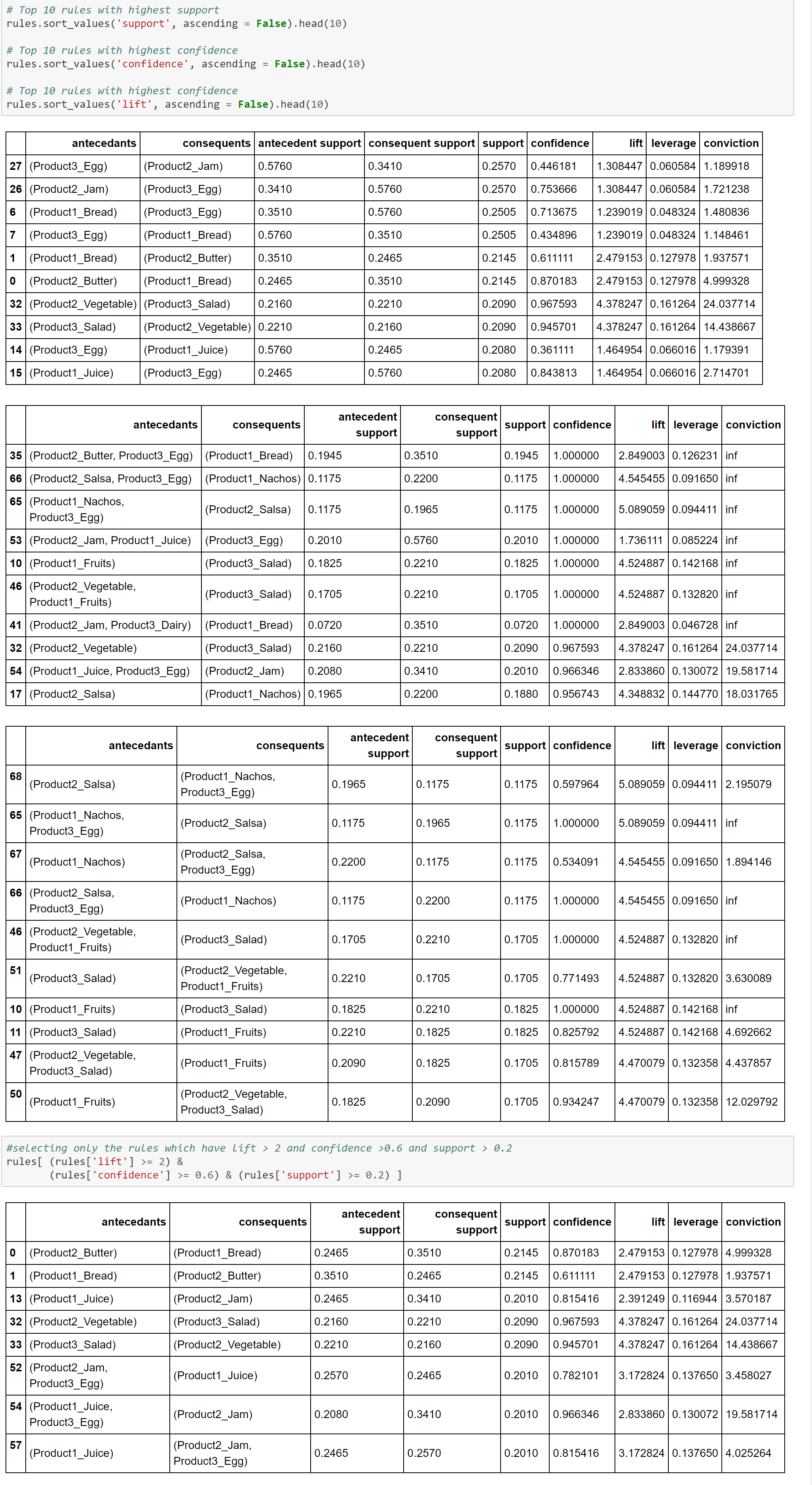
First of all, if you are not familiar with the concept of Market Basket Analysis (MBA), Association Rules or Affinity Analysis and related metrics such as Support, Confidence and Lift, please read this article first.
Here is how we can do it in Python. We will look at two examples-
Example 1-
Data used for this example can be found here Retail_Data.csv
Linear Discriminant Analysis (LDA) is similar to Principal Component Analysis (PCA) in reducing the dimensionality. However, there are certain nuances with LDA that we should be aware of-
LDA is supervised (needs categorical dependent variable) to provide the best linear combination of original variables while providing the maximum separation among the different groups. On the other hand, PCA is unsupervised
LDA can be used for classification also, whereas PCA is generally used for unsupervised learning
LDA doesn’t need the numbers of discriminant to be passed on ahead of time. Generally speaking the number of discriminant will be lower of the number of variables or number of categories-1.
LDA is more robust and can be conducted without even standardizing or normalizing the variables in certain cases
LDA is preferred for bigger data sets and machine learning
Principal Component Analysis ( PCA) is generally used as an unsupervised algorithm for reducing the data dimensions to address Curse of Dimensionality, detecting outliers, removing noise, speech recognition and other such areas.
The underlying algorithm in PCA is generally a linear algebra technique called Singular Value Decomposition (SVD). PCAs take the original data and create orthogonal components (uncorrelated components) that capture the information contained in the original data however with significantly less number of components.
Either the components themselves or key loading of the components can be plugged in any further modeling work, rather than the original data to minimize information redundancy and noise.
There are three main ways to select the right number of components-
Number of components should explain at least 80% of the original data variance or information [Preferred One]
Eigen value of each PCA component should be more than or equal to 1. This means that they should express at least one variable worth of information
Elbow or Scree method- look for the elbow in the percentage of variance explained by each components and select the components where an elbow or kink is visible.
You can use any one of the above or combination of the above to select the right number of components. It is very critical to standardize or normalize data before conducting PCA.
In the below case study we will use the first criterion shown above, i.e. 80% or more of the original data variance should be explained by the selected number of components.
Logistic regression is a supervised machine learning algorithm used for binary classification — predicting whether an outcome belongs to one of two classes (e.g., survived / did not survive, spam / not spam, fraud / not fraud).
Unlike linear regression, which predicts a continuous value, logistic regression predicts a probability that an observation belongs to the positive class. That probability is then converted into a class label using a decision threshold (typically 0.5).
Use Cases
Logistic regression is widely used when the target is binary or can be treated as binary:
Domain
Example
Healthcare
Disease diagnosis (positive / negative test result)
In this notebook, we use logistic regression to predict whether a Titanic passenger survived (1) or not (0) based on features such as age, gender, fare, and passenger class.
The Model Equation
Logistic regression starts with a linear combination of features (similar to linear regression):
z = β₀ + β₁x₁ + β₂x₂ + … + βₙxₙ
This value z is passed through the sigmoid (logistic) function to produce a probability between 0 and 1:
P(y = 1 | x) = σ(z) = 1 / (1 + e^(-z))
Where:
P(y=1 | x) = probability of the positive class
β₀ = intercept (bias term)
β₁, β₂, …, βₙ = coefficients (weights) for each feature
x₁, x₂, …, xₙ = input feature values
The sigmoid function squashes any real number into the range (0, 1), making it ideal for probability estimation.
Log-Odds (Logit)
Instead of modeling probability directly, logistic regression can be understood as modeling the log-odds (also called the logit) of the outcome:
p / (1-p) = odds (ratio of probability of success to probability of failure)
ln(p / (1-p)) = log-odds or logit
Key insight: The logit transforms a probability (bounded 0–1) into an unbounded real number, allowing us to use a linear model. A one-unit increase in a feature changes the log-odds by that feature’s coefficient βⱼ.
Example: If β_gender = 1.5, being in the coded “female” category increases the log-odds of survival by 1.5 — which corresponds to multiplying the odds by e^1.5 ≈ 4.48.
Algorithm & Optimization
Logistic regression learns the coefficients β₀, β₁, …, βₙ by maximizing the likelihood of observing the actual training labels — equivalent to minimizing the log-loss (cross-entropy loss):
predict_proba() returns the raw probabilities, which we use later in this notebook for threshold optimization and detailed prediction analysis.
Logistic Regression vs. Linear Regression
Logistic Regression vs. Linear Regression
Aspect
Linear Regression
Logistic Regression
Output
Continuous value
Probability (0 to 1)
Link function
Identity
Sigmoid (logit)
Loss function
Mean Squared Error
Log-loss (cross-entropy)
Use case
Predicting quantities
Binary classification
Strengths & Limitations
Strengths:
Simple, fast, and highly interpretable
Outputs well-calibrated probabilities
Works well as a baseline classifier
Less prone to overfitting with small datasets (with regularization)
Limitations:
Assumes a linear decision boundary in log-odds space
Struggles with complex non-linear relationships
Sensitive to feature scaling (we apply StandardScaler in this notebook)
Requires thoughtful handling of missing values and categorical encoding
CODES
# ============================================================================= # IMPORTS AND ENVIRONMENT SETUP # ============================================================================= # Import core libraries for numerics, data handling, and plotting import numpy as np import pandas as pd from matplotlib import pyplot as plt import seaborn as sns #import pandas_profiling %matplotlib inline !pip install tqdm
# Enable multiple expressions per cell in Jupyter (shows all results, not just last) from IPython.core.interactiveshell import InteractiveShell InteractiveShell.ast_node_interactivity = “all”
# ============================================================================= # EXPLORATORY DATA ANALYSIS — Titanic Dataset Overview # ============================================================================= # Load a fresh copy of the Titanic dataset for initial exploration titanic_eda = sns.load_dataset(‘titanic’)
# — Dataset shape and basic statistics — print(“=” * 60) print(“TITANIC DATASET — EXPLORATORY DATA ANALYSIS”) print(“=” * 60) print(f”\nDataset Shape: {titanic_eda.shape[0]} rows x {titanic_eda.shape[1]} columns”) print(f”Overall Survival Rate: {titanic_eda[‘survived’].mean():.1%}”) print(“\n— Missing Values —“) print(titanic_eda.isna().sum()) print(“\n— Survival by Gender —“) print(titanic_eda.groupby(‘sex’)[‘survived’].mean().round(3)) print(“\n— Survival by Passenger Class —“) print(titanic_eda.groupby(‘pclass’)[‘survived’].mean().round(3))
# ============================================================================= # LOAD TITANIC DATA # ============================================================================= # Load the built-in Titanic dataset from seaborn and preview first/last rows titanic = sns.load_dataset(‘titanic’) titanic.head() titanic.tail()
# ============================================================================= # PROGRESS BAR DEMO (tqdm) # ============================================================================= # Demonstrate tqdm progress bar utility from tqdm import tqdm from time import sleep with tqdm(total=100) as pbar: for i in range(10): sleep(0.1) pbar.update(10)
# ============================================================================= # DROP REDUNDANT / LEAKAGE COLUMNS # ============================================================================= # Remove columns that duplicate information or would leak the target variable # Note: ‘deck’ is kept here because it is imputed later in the missing-value section titanic.drop([‘alive’, ‘class’,’who’, ’embark_town’, ‘alone’, ‘adult_male’] ,axis=1,inplace=True)
# Preview cleaned dataframe titanic.head()
# Check data types and non-null counts titanic.info()
# Explore embarked port distribution before handling missing values titanic[’embarked’].value_counts()
# Find the most frequent embarkation port (used for imputation) titanic[’embarked’].mode()
# Inspect rows with missing embarked values titanic.iloc[[61,684],:]
titanic.info()
# Fill missing embarked values with the mode (most common port: Southampton) titanic[’embarked’] = titanic[’embarked’].fillna(titanic[’embarked’].mode()[0])
titanic.info()
# Summary of remaining missing values across all columns titanic.isna().sum()
# ============================================================================= # DECK COLUMN — MISSING VALUE TREATMENT # ============================================================================= # Convert deck to object type and fill missing deck values with ‘Not Assigned’ # (Must run before categorical encoding so deck is not dropped and median fill works) titanic.deck = titanic.deck.astype(‘object’)
# ============================================================================= # ENCODE CATEGORICAL VARIABLES AS INTEGER CODES # ============================================================================= # Convert object-type columns to numeric category codes for modeling for x in titanic.columns: if titanic[x].dtype == “object”: titanic[x]=pd.Categorical(titanic[x]).codes
titanic.head()
# ============================================================================= # IMPUTE MISSING AGE WITH MEDIAN # ============================================================================= # Compute median age and fill missing age values titanic[‘age’].median()
# Sample and inspect the cleaned dataset titanic.head(10) titanic.sample(10) titanic.tail(10) titanic.info()
titanic.columns
titanic.info()
# ============================================================================= # DESCRIPTIVE STATISTICS AND OUTLIER ANALYSIS # ============================================================================= # Summary statistics for all numeric columns titanic.describe()
# Percentile distribution to identify potential outliers titanic.quantile((0, 0.01,0.05, 0.5, 0.95,0.99, 1.0))
# Visualize fare distribution before clipping outliers titanic.fare.hist()
# Clip fare outliers at the 99th percentile upper bound titanic.fare = np.clip(titanic.fare,0,249.00622 )
titanic.fare.describe()
titanic.fare.hist()
titanic.info()
titanic.describe()
# Clip all numeric columns to their 1st and 99th percentile bounds for x in titanic.columns: outlier = titanic[x].quantile([0.01,0.99]).values titanic[x] = np.clip(titanic[x], outlier[0], outlier[1])
titanic.describe()
# prompt: read a csv file
#df = pd.read_csv(‘filename.csv’)
titanic.describe() titanic.head()
# Check class balance of the target variable (survived) titanic.groupby(‘survived’).size()
titanic.shape
# ============================================================================= # PREPARE FEATURES (X) AND TARGET (y) # ============================================================================= # Import scikit-learn modules for splitting, metrics, and logistic regression from sklearn.model_selection import train_test_split from sklearn import metrics from sklearn.linear_model import LogisticRegression
# Separate features from target variable x = titanic.drop([‘survived’], axis = 1, inplace=False) y = titanic[‘survived’] x.shape print(‘\n’) y.shape
# ============================================================================= # TRAIN / TEST SPLIT # ============================================================================= # Split in Train and Test data x_train, x_test, y_train, y_test = train_test_split(scld_titanic_df, y, test_size=0.2, random_state=999) x_train.shape y_train.shape x_test.shape y_test.shape
x_train y_train x_test
# Check survival rate (% positive class) in train and test sets np.round(y_train.sum()/y_train.count()*100,2) print(‘\n’) np.round(y_test.sum()/y_test.count()*100,2)
# Fit the model on training data log.fit(x_train, y_train)
# ============================================================================= # PREDICTIONS AND EVALUATION # ============================================================================= # Generate class predictions on the test set predicted = log.predict(x_test) predicted
from sklearn import metrics print((metrics.classification_report(y_test, predicted)))
# Build confusion matrix comparing actual vs predicted labels df_confusion = metrics.confusion_matrix(y_test,predicted) df_confusion
import seaborn as sns import matplotlib.pyplot as plt # Visualize confusion matrix as a heatmap sns.heatmap(df_confusion, cmap = ‘Greens’,xticklabels=[‘Prediction No’,’Prediction Yes’], yticklabels=[‘Actual No’,’Actual Yes’], annot=True, fmt=’d’) plt.show();
# ============================================================================= # MODEL INTERPRETATION — COEFFICIENTS # ============================================================================= # Raw model coefficients (log-odds impact of each feature) log.coef_
x.columns
# Combine feature names with their coefficients for readability coeff = pd.concat([pd.DataFrame(x.columns), pd.DataFrame(np.transpose(log.coef_))],axis =1 ) coeff.columns = (“Variable”, ‘Coeff’)
coeff
# ============================================================================= # PROBABILITY PREDICTIONS AND THRESHOLD ANALYSIS # ============================================================================= # Find out probability of the classes and predicted classes predicted_prob = log.predict_proba(x_test) predicted_prob_df = pd.DataFrame(predicted_prob) predicted_classes_df = pd.DataFrame(predicted) y_actual_df = pd.DataFrame(y_test.values) predicted_df = pd.concat([predicted_prob_df, predicted_classes_df, y_actual_df], axis=1) predicted_df.columns = [‘Prob_0′,’Prob_1′,’Predicted_Class’, ‘Actual_Class’] predicted_df.sample(20)
predicted_prob
Output Block
Requirement already satisfied: tqdm in /usr/local/lib/python3.12/dist-packages (4.67.3) ============================================================ TITANIC DATASET — EXPLORATORY DATA ANALYSIS ============================================================
— Missing Values — survived 0 pclass 0 sex 0 age 177 sibsp 0 parch 0 fare 0 embarked 2 class 0 who 0 adult_male 0 deck 688 embark_town 2 alive 0 alone 0 dtype: int64
— Survival by Gender — sex female 0.742 male 0.189 Name: survived, dtype: float64
— Survival by Passenger Class — pclass 1 0.630 2 0.473 3 0.242 Name: survived, dtype: float64 /tmp/ipykernel_597/1527970602.py:40: FutureWarning:
Passing `palette` without assigning `hue` is deprecated and will be removed in v0.14.0. Assign the `x` variable to `hue` and set `legend=False` for the same effect.
Passing `palette` without assigning `hue` is deprecated and will be removed in v0.14.0. Assign the `x` variable to `hue` and set `legend=False` for the same effect.
Requirement already satisfied: tqdm in /usr/local/lib/python3.12/dist-packages (4.67.3)
============================================================
TITANIC DATASET — EXPLORATORY DATA ANALYSIS
============================================================

Dataset Shape: 891 rows x 15 columns
Overall Survival Rate: 38.4%

--- Missing Values ---
survived         0
pclass           0
sex              0
age            177
sibsp            0
parch            0
fare             0
embarked         2
class            0
who              0
adult_male       0
deck           688
embark_town      2
alive            0
alone            0
dtype: int64

--- Survival by Gender ---
sex
female    0.742
male      0.189
Name: survived, dtype: float64

--- Survival by Passenger Class ---
pclass
1    0.630
2    0.473
3    0.242
Name: survived, dtype: float64
/tmp/ipykernel_597/1527970602.py:40: FutureWarning:

Passing `palette` without assigning `hue` is deprecated and will be removed in v0.14.0. Assign the `x` variable to `hue` and set `legend=False` for the same effect.

  sns.countplot(data=titanic_eda, x='survived', ax=axes[0, 0], palette='Set2')
/tmp/ipykernel_597/1527970602.py:63: FutureWarning:

Passing `palette` without assigning `hue` is deprecated and will be removed in v0.14.0. Assign the `x` variable to `hue` and set `legend=False` for the same effect.

  sns.boxplot(data=titanic_eda, x='survived', y='fare', ax=axes[0], palette='Pastel1')
/tmp/ipykernel_597/2760321974.py:2: FutureWarning:

Passing `palette` without assigning `hue` is deprecated and will be removed in v0.14.0. Assign the `x` variable to `hue` and set `legend=False` for the same effect.

  sns.barplot(x='Variable', y='Coeff', data=coeff, palette='viridis')
Converting categorical variables into numerical dummy coded variable is generally a requirement in machine learning libraries such as Scikit as they mostly work on numpy arrays.
In this blog, let’s look at how we can convert bunch of categorical variables into numerical dummy coded variables using four different methods-
Scikit learn preprocessing LabelEncoder
Pandas getdummies
Looping
Mapping
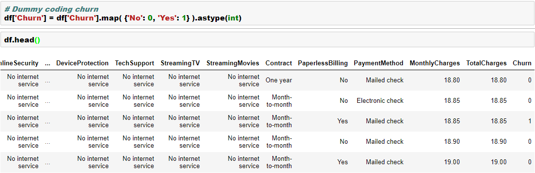
We will work with a dataset from IBM Watson blog as this has plenty of categorical variables. You can find the data here. In this data, we are trying to build a model to predict “churn”, which has two levels “Yes” and “No”.
We will convert the dependent variable using Scikit LabelEncoder and the independent categorical variables using Pandas getdummies. Please note that LabelEncoder will not necessarily create additional columns, whereas the getdummies will create additional columns in the data. We will see that in the below example-
Here are few other ways to dummy coding-
Here is an excellent Kaggle Kernel for detailed feature engineering.
As highlighted in the article, clustering and segmentation play an instrumental role in Data Science. In this blog, we will show you how to build a Hierarchical Clustering with Python.
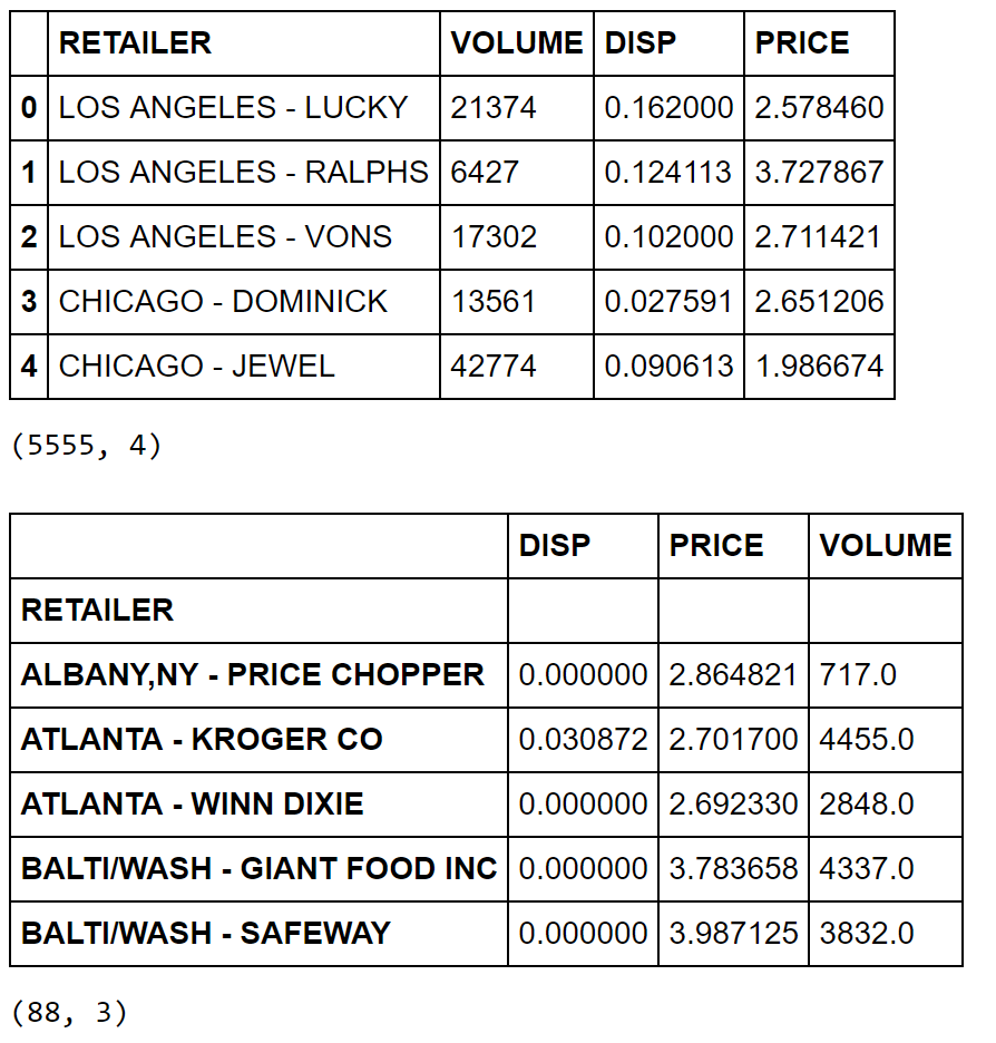
For this purpose, we will work with a R dataset called “Cheese”. Please install package called “Bayesm” in R and export this data set in csv format to be imported in Python. More on this dataset can be found here.




















You must be logged in to post a comment.