Model Explainability — A Clear and Practical Guide
Dataset used for demonstration later: Titanic dataset
1️⃣ What is Model Explainability?
Simple Definition
Model explainability is the ability to understand why a machine learning model made a specific prediction.
If a model predicts:
“Passenger will survive with 82% probability”
Explainability answers:
- Why 82%?
- Which features contributed most?
- What pushed the prediction up?
- What pushed it down?
- Would the prediction change if something changed?
Intuitive Analogy
Think of a machine learning model like a committee voting system.
Each feature (age, fare, gender, class, etc.) casts a vote:
- Some votes push toward “Survive”
- Some push toward “Not Survive”
Explainability tells us:
- Who voted?
- How strongly?
- Who had the most influence?
Without explainability, you only see the final vote count — not how the decision was made.
2️⃣ Why Model Explainability Matters
1. Trust
Stakeholders will not trust black-box predictions.
2. Debugging
You detect:
- Data leakage
- Bias
- Wrong feature behavior
- Spurious correlations
3. Compliance
Industries like:
- Banking
- Healthcare
- Government
often require explainability.
4. Fairness
You can detect whether sensitive attributes influence predictions unfairly.
3️⃣ Two Types of Explainability
A) Global Explainability
Answers:
“How does the model behave overall?”
Examples:
- Which features are most important?
- Does age increase or decrease survival probability?
- Is fare positively correlated with survival?
B) Local Explainability
Answers:
“Why did the model predict THIS specific case like this?”
Example:
Passenger A:
- Age = 60
- Male
- 3rd class
- Fare = 7
Why did this specific passenger get 12% survival probability?
4️⃣ Categories of Explainability Techniques
Explainability techniques fall into 3 major groups:
1️⃣ Intrinsic Explainability (Model is Naturally Interpretable)
These models are transparent by design.
Examples:
- Linear Regression
- Logistic Regression
- Decision Trees (small ones)
Example (Logistic Regression)
log odds=β0+β1X1+β2X2
Interpretation:
- Positive coefficient → increases probability
- Negative coefficient → decreases probability
Very easy to explain.
Limitation:
- Often less powerful than complex models
2️⃣ Post-hoc Explainability (Explain After Training)
Used for black-box models like:
- Random Forest
- XGBoost
- Neural Networks
These models are powerful but not naturally interpretable.
We apply explanation techniques after training.
This includes:
- SHAP
- LIME
- Permutation Importance
- PDP
- ICE
- Counterfactual explanations
3️⃣ Model-Agnostic vs Model-Specific
Model-Agnostic
Works with any model.
Examples:
- LIME
- Permutation Importance
- PDP
- SHAP (KernelExplainer)
Model-Specific
Optimized for certain models.
Examples:
- TreeSHAP (for tree models)
- DeepSHAP (for neural networks)
5️⃣ Major Explainability Techniques (Simple Interpretation)
🔷 SHAP (SHapley Additive exPlanations)
Core idea:
Each feature gets a fair contribution value toward the final prediction.
Think of it like:
If total prediction = 0.820.82=Base Value+Contributionsex+Contributionfare+…
Interpretation in simple terms:
- Red bar → pushes prediction higher
- Blue bar → pushes prediction lower
- Larger bar → stronger influence
SHAP gives:
- Global explanations
- Local explanations
- Consistent feature importance
Strength:
Mathematically grounded in game theory.
🔷 LIME (Local Interpretable Model-Agnostic Explanations)
Core idea:
Zoom into one prediction and approximate it using a simple linear model locally.
Think of it like:
“Around this passenger, the complex model behaves approximately like this simple equation.”
Interpretation:
- Shows top features influencing THIS prediction
- Only local — not global
Strength:
Works with any model.
Limitation:
Approximate, not exact.
🔷 Permutation Feature Importance
Core idea:
Shuffle one feature.
See how much performance drops.
If performance drops significantly → feature is important.
Interpretation:
- Larger drop = more important feature
Simple and intuitive.
🔷 Partial Dependence Plot (PDP)
Core idea:
“How does prediction change when ONE feature changes?”
Interpretation:
- X-axis → feature value
- Y-axis → predicted probability
Example:
If fare increases → survival probability increases.
This shows direction and shape of relationship.
🔷 ICE (Individual Conditional Expectation)
Like PDP but for individual samples.
Interpretation:
- Each line = one passenger
- Shows variability across individuals
🔷 Counterfactual Explanations
Answers:
“What minimal change would flip the prediction?”
Example:
“If this passenger were female instead of male, survival probability would increase to 70%.”
Extremely intuitive for stakeholders.
6️⃣ How to Interpret Explainability in Very Simple Terms
Imagine explaining to a non-technical person:
Instead of saying:
“SHAP value for feature 3 is 0.21”
You say:
“Being female significantly increased survival probability.”
Instead of:
“Permutation importance score = 0.12”
You say:
“If we remove gender information, model accuracy drops a lot — so gender is very important.”
7️⃣ When to Use Which Method
| Goal | Recommended Method |
|---|---|
| Feature ranking | Permutation / SHAP |
| Single prediction explanation | SHAP / LIME |
| Understand feature behavior | PDP |
| Check fairness | SHAP + subgroup analysis |
| Regulatory environment | SHAP + Counterfactuals |
8️⃣ What Explainability Is NOT
Important clarity:
- It does NOT make model causal.
- It does NOT prove real-world causation.
- It only explains how the model behaves.
Example:
If model says:
“Higher fare → higher survival probability”
That does NOT mean fare causes survival.
It may correlate with passenger class.
9️⃣ Big Picture Summary
Explainability answers three questions:
- What features matter most?
- How do they affect predictions?
- Why did this specific prediction happen?
Think of it as turning:
🔒 Black Box
into
🔎 Glass Box
Hands-on Code for SHAP
# ==========================================================# SECTION 0: INSTALL REQUIRED LIBRARIES# Run this cell once (skip if already installed)# ==========================================================!pip install shap lime eli5 seaborn# ==========================================================# SECTION 1: IMPORT LIBRARIES# ==========================================================# Data handlingimport pandas as pdimport numpy as npimport seaborn as sns# Visualizationimport matplotlib.pyplot as plt# Model buildingfrom sklearn.model_selection import train_test_splitfrom sklearn.ensemble import RandomForestClassifierfrom sklearn.preprocessing import LabelEncoderfrom sklearn.metrics import accuracy_score# Explainability toolsimport shapfrom lime.lime_tabular import LimeTabularExplainerfrom sklearn.inspection import permutation_importancefrom sklearn.inspection import PartialDependenceDisplayimport eli5from eli5.sklearn import PermutationImportance# Improve plot readabilityplt.rcParams["figure.figsize"] = (8, 6)print("Libraries imported successfully.")# ==========================================================# SECTION 2: LOAD AND PREPROCESS DATA# ==========================================================# Load Titanic dataset from seaborndf = sns.load_dataset("titanic")# Select relevant columnsdf = df[['survived', 'pclass', 'sex', 'age', 'sibsp', 'parch', 'fare']]# Fill missing age values with mediandf['age'] = df['age'].fillna(df['age'].median())# Encode 'sex' (male=1, female=0)le = LabelEncoder()df['sex'] = le.fit_transform(df['sex'])# Separate features and targetX = df.drop('survived', axis=1)y = df['survived']# Split into train and test setsX_train, X_test, y_train, y_test = train_test_split( X, y, test_size=0.2, random_state=42)print("Data prepared successfully.")print("Training samples:", X_train.shape)print("Testing samples:", X_test.shape)# ==========================================================# SECTION 3: MODEL TRAINING# ==========================================================# Initialize Random Forestmodel = RandomForestClassifier( n_estimators=200, # Number of trees random_state=42)# Train modelmodel.fit(X_train, y_train)# Evaluatey_pred = model.predict(X_test)accuracy = accuracy_score(y_test, y_pred)print("Model trained successfully.")print("Model Accuracy:", accuracy)# ==========================================================# SECTION 4: SHAP# ==========================================================import shap# Create explainer (auto-detects correct type)explainer = shap.Explainer(model)# Calculate SHAP valuesshap_values = explainer(X_test)print("SHAP values shape:", shap_values.values.shape)print(shap_values)# If 3D (binary classification), select class 1if len(shap_values.values.shape) == 3: shap_values = shap_values[:, :, 1]# Beeswarm plot (best global visualization)shap.plots.beeswarm(shap_values)shap.plots.bar(shap_values)# Pick one passengersample_index = 0shap.plots.waterfall(shap_values[sample_index])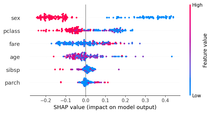
Overall Purpose: It provides a comprehensive summary of model behavior across the entire dataset, displaying the distribution of feature impacts rather than just average importance.
Vertical Axis (Y-Axis) – Features: Features are ranked in descending order based on their importance (mean absolute SHAP values), with the most influential features at the top.
Horizontal Axis (X-Axis) – SHAP Value: The horizontal position of each dot indicates the impact of that feature on the model’s output. Points on the right (positive SHAP values) increase the prediction; points on the left (negative SHAP values) decrease it.
Color-Coded Feature Values: Dot color indicates the original value of the feature for that sample. Typically, red represents a high value for the feature, while blue represents a low value.
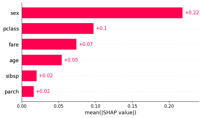
Global Importance: The bar plot represents the mean absolute SHAP value for each feature. It answers the question: “On average, how much does this feature change the model output (in either direction)?”
Feature Ranking: Features are listed on the y-axis, typically sorted from top to bottom. The feature at the very top has the highest average impact on the model’s decisions.
Magnitude (x-axis): Unlike the beeswarm plot, the x-axis only shows positive values. It represents the average magnitude of the effect
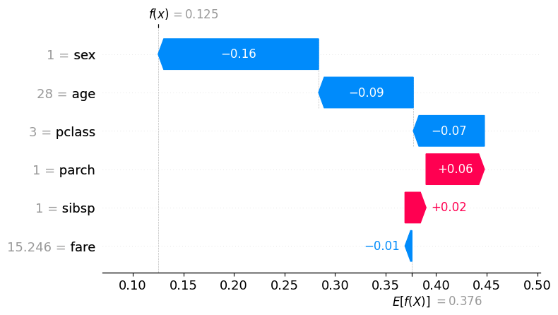
Local Interpretation: Unlike the global bar or beeswarm plots, the waterfall plot is designed for single samples (local interpretability). Each observation in your dataset has its own unique waterfall plot.
Starting Point (Base Value): The plot begins at the Expected Value (bottom of the y-axis), which represents the average model output across the entire training dataset.
Incremental “Steps”: Features are listed on the y-axis, usually sorted by the magnitude of their impact for that specific prediction. Each bar represents a “step” that either increases or decreases the prediction. Direction and Color:
Red Bars (+): Indicate features that increased the prediction relative to the average. Blue Bars (-): Indicate features that decreased the prediction relative to the average.
Actual Feature Values: Next to each feature name on the y-axis, the plot displays the actual value (e.g., Age = 25) that the feature held for that specific sample.
Final Prediction ( ): The top of the plot shows the final model output for that instance. The sum of all the “steps” plus the base value equals this final value ( ).

You must be logged in to post a comment.